| Channel | Publish Date | Thumbnail & View Count | Actions |
|---|---|---|---|
 EXCEL MAGIC EXCEL MAGIC | 2025-03-03 04:27:49 | 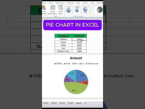 265 Views |
How to Create a Pie Chart in Excel | Step-by-Step Guide
Are you looking to create a **pie chart in Excel** but not sure where to start? In this step-by-step tutorial, we’ll walk you through the entire process—from inputting your data to customizing your chart for a professional look. Whether you’re a beginner or an Excel pro, this video will help you visualize your data effectively using **Excel pie charts**.
**In This Video, You Will Learn:**
What a **pie chart** is and when to use it
How to enter data correctly for a **pie chart in Excel**
Step-by-step process to **insert a pie chart**
Customizing the chart (colors, labels, and styles)
Adding percentages to make your chart clearer
**3D Pie Charts** and when to use them
**Best practices** to make your pie charts stand out
**Timestamps:**
00:00 – Introduction
00:45 – When to Use a Pie Chart?
02:30 – Entering Data for a Pie Chart
04:10 – Inserting a Pie Chart in Excel
06:25 – Customizing the Pie Chart (Colors, Labels, Styles)
08:15 – Adding Data Labels & Percentages
10:05 – Using a 3D Pie Chart
12:00 – Best Practices for Pie Charts
13:45 – Common Mistakes to Avoid
15:00 – Final Thoughts
—
## **What Is a Pie Chart and When to Use It?**
A **pie chart** is a circular chart that represents data as slices of a pie, where each slice corresponds to a category’s proportion in the whole dataset. **Pie charts** are best used when you need to compare parts of a whole rather than trends over time.
**Examples of when to use a pie chart:**
– **Market share analysis** of different companies
– **Sales distribution** among product categories
– **Budget allocation** for different expenses
– **Survey results** showing percentage-based responses
However, **avoid using a pie chart** if you have too many categories (more than 6-7) or if the differences in values are too small to distinguish visually. In such cases, a **bar chart or column chart** might be a better choice.
—
## ️ **Step 1: Enter Data for Your Pie Chart**
Before creating a **pie chart in Excel**, you need well-structured data.
Follow these steps:
1. Open **Microsoft Excel** and create a new spreadsheet.
2. In **Column A**, list the categories (e.g., Product A, Product B, Product C).
3. In **Column B**, enter the corresponding values (e.g., sales figures, survey percentages).
Example:
| Product | Sales |
|———-|——|
| Product A | 300 |
| Product B | 500 |
| Product C | 200 |
Make sure your data is **accurate and well-organized**, as Excel uses this data to generate the pie chart.
—
## **Step 2: Insert a Pie Chart in Excel**
Once your data is ready, follow these steps to **create a pie chart**:
1. Select the data range (**including headers**). Example: **A1:B4**.
2. Go to the **Insert** tab on the Excel ribbon.
3. Click on the **Pie Chart** icon in the Charts group.
4. Choose a **chart type**:
– **2D Pie** (Most commonly used)
– **3D Pie** (For a 3D effect)
– **Doughnut Chart** (Similar to a pie chart but with a hole in the center)
5. The pie chart will automatically appear on your Excel sheet.
—
## **Step 3: Customize Your Pie Chart**
Now that your **Excel pie chart** is created, it’s time to make it look professional!
### ️ **Changing Chart Colors & Styles**
– Click on the chart to activate the **Chart Tools** tab.
– Under **Chart Design**, choose a style that best fits your data presentation.
– Use the **Format** tab to change **colors**, **borders**, or add **shadows** for better visibility.
### **Adding Data Labels & Percentages**
– Click on the **chart** to select it.
– Click on **Chart Elements** (the “+” icon on the top-right corner of the chart).
– Check the **Data Labels** option.
– To show percentages instead of actual values:
– Click on **Data Labels** → **More Options** → Select **Percentage**.
### **Making Your Pie Chart Stand Out**
– Use **contrasting colors** for different slices.
– **Explode a slice** (pull one slice out for emphasis).
– Add a **chart title** that clearly describes the data.
next video link
https://youtube.com/shorts/lvOvrFdplco?si=fgIvPWcKNVg7P12t
To ensure your **Excel pie chart** is effective, follow these best practices:
️ **Keep It Simple** – Avoid using too many slices (limit to 6-7).
️ **Use Contrasting Colors** – Different colors help differentiate the slices.
️ **Sort Slices by Size** – Arrange data in descending order for clarity.
️ **Label Clearly** – Display **percentages** instead of raw numbers.
️ **Avoid 3D Effects** (if unnecessary) – It can distort the perception of data.
#Excel #PieChart #DataVisualization #MicrosoftExcel #ExcelTips
Pie chart in excel | How to create a pie chart in google sheets | excel | #shorts #piechart #excel
Please take the opportunity to connect and share this video with your friends and family if you find it useful.