| Channel | Publish Date | Thumbnail & View Count | Actions |
|---|---|---|---|
 Chester Tugwell Chester Tugwell | 2024-03-27 14:00:26 | 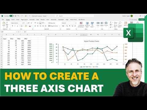 22,435 Views |
https://www.paypal.com/donate/?hosted_button_id=CGKRY2BAYEQBQ
Thank you!
Download the featured file here: https://www.bluepecantraining.com/wp-content/uploads/2024/03/Chart-with-3-axis.xlsx
In this Microsoft Excel video tutorial I explain how to create a three-axis graph in Excel. Excel doesn’t have a chart type for this but this video shows the workaround.
️ Timestamps
00:00 Introduction
00:12 Create a chart
00:27 Duplicate the chart
00:34 Delete unwanted series in each chart
00:53 Create a secondary axis in the original chart
01:11 Change the colour of each vertical axis
02:28 Show tick marks on each vertical axis
02:59 Enter a chart title
03:26 Remove the background on the copy of the chart
03:55 Change the minimum value on the horizontal axis of the copy of the chart
04:49 Hide the horizontal axis in the copy of the chart
05:05 Remove gridlines in the copy of the chart
05:14 Overlay and align the charts
05:39 Adjust the legend
05:51 Remove the chart area borders
06:12 Add a rectangle behind the charts
06:46 Group the charts
#exceltips #exceltricks #exceltutorial #excelchart
Please take the opportunity to connect and share this video with your friends and family if you find it useful.