
| Channel | Publish Date | Thumbnail & View Count | Actions |
|---|---|---|---|
 DataDash Pro DataDash Pro | 2023-12-15 15:58:42 | 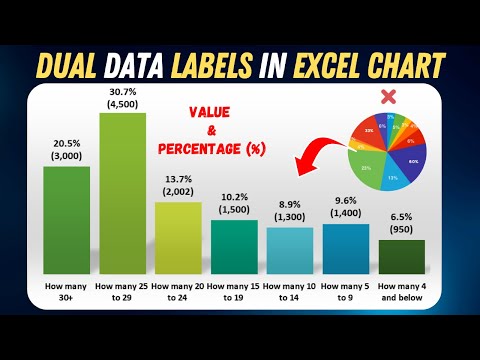 71,295 Views |
Unlock the power of Excel charts with this step-by-step tutorial! Learn how to showcase both percentage % and value labels in your column charts effortlessly. Perfect for beginners and Excel enthusiasts!
Keywords
Excel Column Chart
Data Labels
Percentage and Value
Tutorial for Beginners
Excel Tips and Tricks
Chart Customization
Data Visualization
Easy Excel Hacks
In this video, you’ll discover:
How to create a stunning Column Chart in Excel.
Simple steps to add both Percentage % and Value labels to your chart.
Tips for formatting and customizing data labels for clarity.
Real-world examples to enhance your data visualization skills.
Timestamps:
00:00 – Why we need Dual Data Lable Column Chart
0:38 – Creating basic Chart
01:21 – Calculating % for Column Chart in Excel
02:18 – Formatting Value using Text Function Excel
02:41 – ClipBoarad In Excel to Save formul
02:53 – TextJoin function real save
If you found this tutorial helpful, please give it a thumbs up, subscribe for more Excel tips, and hit the bell icon to stay updated with our latest content!
Recommended Resources:
Change Chart Type : https://shorturl.at/insCI
Download the Excel File Used in this Tutorial:
[Link to Download]
https://www.youtube.com/watch?v=_p-VT5NmtHs
Please take the opportunity to connect and share this video with your friends and family if you find it useful.


