| Channel | Publish Date | Thumbnail & View Count | Actions |
|---|---|---|---|
 | Publish Date not found |  0 Views |
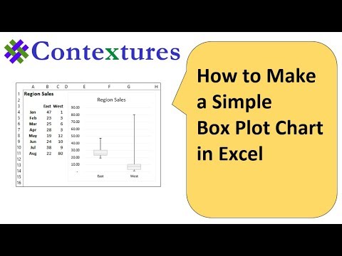
With a box plot (also know as a box and whisker chart), you can show the distribution of numbers in a set of data.
Excel 2013 does not have a built-in Box Plot chart type, but this video shows you how to create one, using a stacked column chart, with error bars.
Save time with Excel Chart Tools: http://www.contextures.com/peltiertech
Instructor: Debra Dalgleish, Contextures Inc.
Get Debra’s weekly Excel tips: http://www.contextures.com/signup01
More Excel Tips and Tutorials: http://www.contextures.com/tiptech.html
Subscribe to Contextures YouTube: https://www.youtube.com/user/contextures?sub_confirmation=1
====
Video Transcript
In this workbook, I have sales data for stores in two regions, and I’m going to create a box plot, or box and whisker chart, to show how that data is distributed.
The first step is to do calculations to get some key numbers. So we want to get the minimum, maximum, quartile one, and three, and the median. These just use simple Excel functions.
So for the minimum, it’s the MIN function, using the data in the east region.
For quartile one, it’s the QUARTILE function, with one as the second argument. And then the MEDIAN function, QUARTILE, three, and MAX. Once you have those done, you can copy them across for the west region.
Those numbers will let us create boxes. We’re going to create a stacked column chart. It will have three boxes in it. The bottom one will be hidden, and then a box going from quartile one to the median, median to quartile three, and we’ll have error bars, one going up to the maximum, and one coming down to the minimum.
To figure out the size of these boxes, we’re going to do calculations in these cells. The first thing we’re going to do is figure out the height of this hidden box.
It goes from the bottom up to the Q1 measurement, so we just have to link to that Q1 measurement cell. Equals Q1, and that tells us how high that hidden box is.
The lower box here goes from Q1 to the median. So in this cell, I’ll type equals, median, minus, Q1.
For the upper box, it’s going to be Q3 minus the median will give us the height here, so equals Q3, minus median, and that will be six. I’ll copy those across for the west region.
The final step is to calculate the length of the whiskers, so the top one is the max minus Q3. Equals max minus Q3. And the bottom one is Q1 minus min. Equals Q1 minus min. And then copy those across.
So we have all the measurements now, and the first step in creating the chart will be to create the stacked column chart. I’m going to select the heading, starting with the blank cell, and across the other two columns. Press the control key and select all the cells with the labels and values for the boxes. On the Insert tab, click the Column Chart, and the Stacked Column.
If you get the wrong layout, here it’s using east and west as series. I want that switched, so I’ll click Switch Row/Column, and now I have east and west stacked.
I’m going to click on that legend and delete it. Now I’ll move this chart off to the side a bit, and make it narrower, so that I can see the data in behind.
To add the whisker at the top, I’m going to select the top box, and on the Design tab of the ribbon, click Add Chart Element, Error Bars, More Error Bar Options. I want a plus. I want this to go up from the top. And scrolling down, I want a custom error amount. Click Specify Value. I’m going to change the positive error value. So I’ll delete what’s in there, and select the two values for the top whisker. Click Okay.
And next, I’ll add error bars to the bottom. This box that’s going to be hidden. So I select that, click Add Chart Element, Error Bars, More Error Bar Options, and this one will be minus. We want it coming down from the top of this base box. For the error amount, custom, specify value. This time, we’re going to delete what’s in there as a negative value. And select the two values that we have for whisker bottom, click Okay, and it’s now coming down from the top of that base box.
This one, we’re going to hide, so I’m going to select it, and on the Format tab, for the Fill, I’ll put No Fill. And as a final step, I will format the other two boxes, so that they’re the same color, with a slightly darker border. So I’ll select this one and I’ll make it a light gray, and slightly darker border.
The same thing for the bottom box. And I’ll click the same fill color and border color. So we now have a box plot with whiskers that show the maximum and the minimum.
#ContexturesExcelTips
Please take the opportunity to connect and share this video with your friends and family if you find it useful.