| Channel | Publish Date | Thumbnail & View Count | Actions |
|---|---|---|---|
 Computergaga Computergaga | 2017-08-01 22:37:33 |  239,998 Views |
Master Excel today with this comprehensive course – https://bit.ly/UltimateExcel
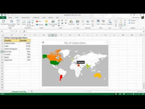
We have a spreadsheet containing the number of subscribers from different countries in the world.
By using the Geographic Heat Map Add-in, we plot a red to green colour scheme across the image of a world map.
This data visualisation will look great on your Excel reports and dashboards. We can see a pattern in our subscribers and the parts of the world where we are successful.
In the video, we also edit the data to show the geographic heat map automatically update with the changes.
Find more great free tutorials at;
https://www.computergaga.com
*** Online Excel Courses ***
The Ultimate Excel Course – Learn Everything ► https://bit.ly/UltimateExcel
Excel VBA for Beginners ► http://bit.ly/37XSKfZ
Advanced Excel Tricks ► https://bit.ly/3CGCm3M
Excel Formulas Made Easy ► http://bit.ly/2ujtOAN
Creating Sports League Tables and Tournaments in Excel ► http://bit.ly/2Siivkm
Connect with us!
LinkedIn ► https://www.linkedin.com/company/18737946/
Instagram ► https://www.instagram.com/computergaga1/
Twitter ► http://www.twitter.com/computergaga1
Please take the opportunity to connect and share this video with your friends and family if you find it useful.


