| Channel | Publish Date | Thumbnail & View Count | Actions |
|---|---|---|---|
 Simple Sheets Simple Sheets | 2022-05-15 23:19:39 | 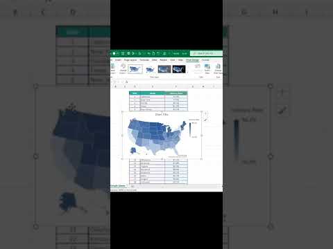 35,421 Views |
1. Select your data. Make sure it’s properly formatted by country/state/region.
2. In the Charts Group of the Insert Tab, select Maps to create a heat map.
3. Edit your map using the Chart Design Tab
Impress everybody at the office when you add this simple but effective tool to your spreadsheets!
Learn and Master Excel with 48+ Excel Lessons AND 100+ Dynamic Excel Templates
#Excel #HeatMap #Dashboarding #MicrosoftExcel #Office365
…
GET ACCESS TO 100+ Dynamic Excel Spreadsheet Templates
https://www.simplesheets.co/
Project Management
Marketing
Supply Chain and Operations
Small Business
Human Resources
Data Analysis
Accounting
Finance
These templates empower you to use Excel to streamline all your personal and business needs.
Customizable
Dynamic
Designed
Formatted
Instructions and Videos
Reporting Visuals
Get 5 FREE Templates When You Sign Up
https://www.simplesheets.co/kanban
https://www.simplesheets.co/plan-do-c…
https://www.simplesheets.co/gantt-chart
https://www.simplesheets.co/saas-metr…
Want to new skills that improve your income, marketability, and expertise?
Our Excel University has 48+ lectures to help you master Microsoft Excel.
https://www.simplesheets.co/excel-uni…
We’ll walk you through everything you need to know to be an Excel Expert
Lookups
Functions
Formulas
Charts and Graphs
Dashboards
Please take the opportunity to connect and share this video with your friends and family if you find it useful.