| Channel | Publish Date | Thumbnail & View Count | Actions |
|---|---|---|---|
 Computergaga Computergaga | 2014-09-26 11:48:45 |  49,195 Views |
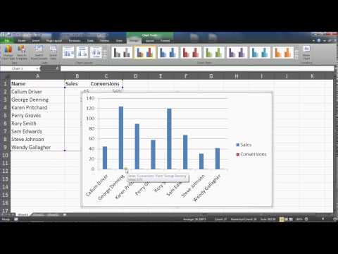
Combination charts are used to compare two different data types or data that varies widely on one chart.
In this video, we create a column and area chart using a secondary axis to view the performance of members of a sales team by the number of sales, and also their conversion ratio.
Liked the Video? Subscribe for more: http://bit.ly/computergaga
Find more great free tutorials at;
https://www.computergaga.com
*** Online Excel Courses ***
The Ultimate Excel Course – Learn Everything ► https://bit.ly/UltimateExcel
Excel VBA for Beginners ► http://bit.ly/37XSKfZ
Advanced Excel Tricks ► https://bit.ly/3CGCm3M
Excel Formulas Made Easy ► http://bit.ly/2ujtOAN
Creating Sports League Tables and Tournaments in Excel ► http://bit.ly/2Siivkm
Connect with us!
LinkedIn ► https://www.linkedin.com/company/18737946/
Instagram ► https://www.instagram.com/computergaga1/
Twitter ► http://www.twitter.com/computergaga1
Please take the opportunity to connect and share this video with your friends and family if you find it useful.


