| Channel | Publish Date | Thumbnail & View Count | Actions |
|---|---|---|---|
 RF Analytics Bangla RF Analytics Bangla | 2021-09-18 14:27:30 |  988 Views |
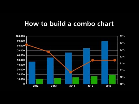
Learning how to build an Excel combo chart (or dual axis chart) is a powerful skill that can help you simplify complex stories around data.
The benefit of a combo chart, compared with a regular chart, is that we can visualize two different data sets on the same chart – for instance – financial ($ denominated) data as well as website conversion rates (% denominated), by adding a secondary vertical axis.
The prerequisite to building an Excel combo chart is that you need to have the right data to visualize. You will have a different type of data on each vertical axis (one on the left and one on the right) but these two types of data will share the horizontal axis.
What this means is that the two types of data need to share the something in common – usually that they happen during the same time (on the horizontal axis) – in order to build an Excel combo chart.
As long as you have the right data, you can add a secondary axis (vertically) and visualize your two data sets one one chart!
By the end of this video you will feel confident creating & adapting dual axis charts and visualizing different types of data. If you have a question – leave me a question in the comments and I’ll get back to you!
Please take the opportunity to connect and share this video with your friends and family if you find it useful.