| Channel | Publish Date | Thumbnail & View Count | Actions |
|---|---|---|---|
 | Publish Date not found |  0 Views |
Adidas, Apple, BMW, Coca-Cola, Toyota… We see these famous brands everywhere but never consider what their logos exactly mean. Curious to know the secret? Watch the 16 famous logos with a hidden meaning you’ve never noticed.
#logomeaning #logosecret #
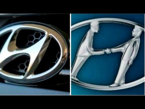
Hyundai 0:33
The letter ’Н’ symbolizes two people – a client and a representative of the company – shaking hands.
Adidas 0:52
The current logo is three stripes at an angle which together form a triangle. This symbolizes a mountain, which in turn represents the challenges that all sportsmen have to overcome day after day.
Apple 1:21
Rob Janoff, the designer who came up with the world-famous Apple company logo, explained his idea in one of his interviews. He bought a bag of apples, placed them in a bowl, and spent time drawing them for a week, trying to break the image down into something simple.
Vaio 1:58
The first two letters of the Vaio logo symbolize an analogue wave. The last two are similar to the numbers 1 and 0 — that is, symbols of a digital signal.
Amazon 2:14
The orange arrow is similar to a smile because the company wants its customers to be satisfied. The arrow is also stretched between the letters ’A’ and ’Z’, in a hint that the company sells absolutely every product you can imagine.
Baskin Robbins 2:40
The pink-colored parts of the /”BR/” section make up the number 31, which is how many ice cream flavors Baskin Robbins used to famously sell.
Toyota 2:56
The logo represents a stylized image of a needle eye with a thread passing through it. This is a hint at the company’s past – they used to produce weaving machines.
Continental 3:28
Continental, a famous car tire producer, has a logo in which the first two letters depict a car wheel.
Formula 1 3:41
If you look carefully at the white space between the letter ’F’ and the red stripes, you can see the number 1.
Pinterest 3:59
On Pinterest, people collect images they like from across the Internet and ’pin’ them to their online boards. That’s why the image of a pin is hidden in the letter P.
Beats 4:17
Beats, an audio equipment producer based in the USA, uses a logo in which the letter ’B’ looks like headphones on a person’s head.
Toblerone 4:32
The famous chocolate company based in Bern, Switzerland, has a silhouette of a bear in its logo. That’s because Bern is sometimes called a city of bears.
BMW 4:55
The logo is simply a part of the Bavarian flag, the area of Germany where the company originated.
LG 5:18
The logo is a stylized image of a person’s face. According to the company, this represents its aspiration to have human relations with their customers.
Evernote 5:34
The corner of the elephant’s ear is folded over in a similar way how people fold the corner of a page to make notes.
Coca-Cola 5:57
In the space between the letters ’O’ and ’L’, you can see the Danish flag. It’s purely a coincidence. Nevertheless, Coca-Cola has used this as part of its marketing campaigns in the Scandinavian country.
If you’ve enjoyed this video, hit that thumbs up button!
Music: That Feeling by HookSounds (http://www.hooksounds.com) is licensed under a Creative Commons license (https://creativecommons.org/licenses/by/4.0/).
Subscribe to Bright Side : https://goo.gl/rQTJZz
—————————————————————————————-
Our Social Media:
Facebook: https://www.facebook.com/brightside/
Instagram: https://www.instagram.com/brightgram/
5-Minute Crafts Youtube: https://www.goo.gl/8JVmuC
—————————————————————————————-
For more videos and articles visit:
http://www.brightside.me/
Please take the opportunity to connect and share this video with your friends and family if you find it useful.